Literati Redesign
Literati Bookstore
Introduction
Literati is an independent bookstore located in the heart of Ann Arbor, MI. The owner is looking to update the site in order to enhance the user experience and increase sales. They’ve received many complaints about their site, especially with their checkout process.
Problem Statement: How might we make it easier for Literati customers to purchase products on the site while conveying Literati’s brand identity?
My Role
UX Designer
UX Researcher
Team
Solo project
Tools
Figma
Baymard Institute
Timeline
September 2021 — 4 weeks
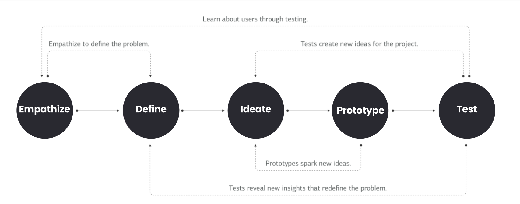
Process Overview
Research Questions
What motivates Literati customers to shop online vs. in-person?
What information is important to users when deciding to purchase a book?
What are the major pain points that users experience when navigating Literati’s site?
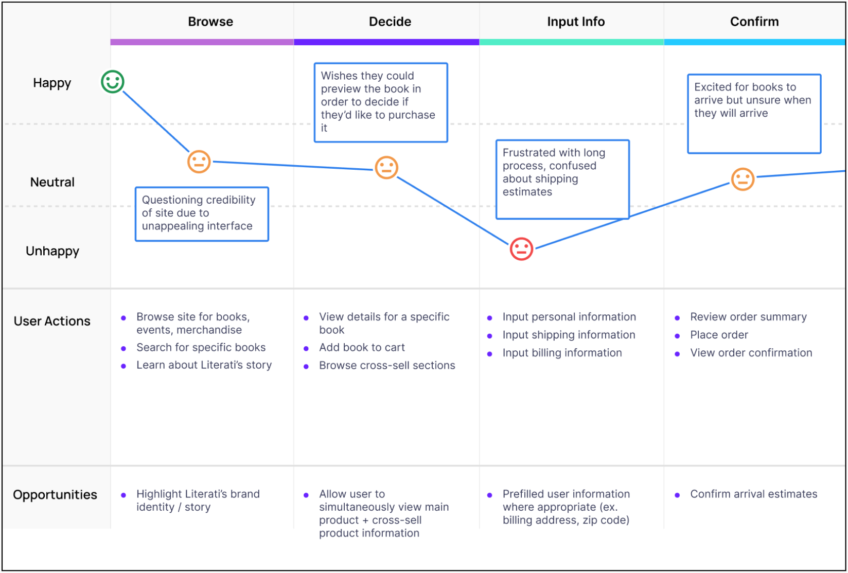
Journey Map
Literati User Journey
User Interviews - Key Insights
1. Tedious checkout experience
“I don’t understand why I have to put in my credit card info if I’m choosing the pick-up option for shipping”
“Why are there a billion steps for checkout?”
“I feel like they could be more clear about the different shipping methods available for each book in your cart.”
2. Customers rely on information such as price, ratings, description, book cover, and previews to decide whether to purchase a book
“When I’m in the store, I can read a couple of pages to preview books. I can’t do that on Literati’s site.”
“The good thing about [buying books online] is that I can look at ratings.”
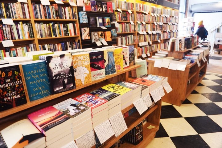
3. Customers love Literati’s in-person experience but feel that the site doesn’t reflect Literati’s in-person atmosphere
“I love going to Literati because of the cozy vibes. You wouldn’t really guess that from looking at their site.”
Design Goals
Streamline the checkout flow
Aid users in deciding whether to add a book to their bag
Rebrand the site’s UI to reflect Literati’s unique brand identity
Problem Statement
How might we make it easier for Literati customers to purchase products on the site while conveying Literati’s brand identity?
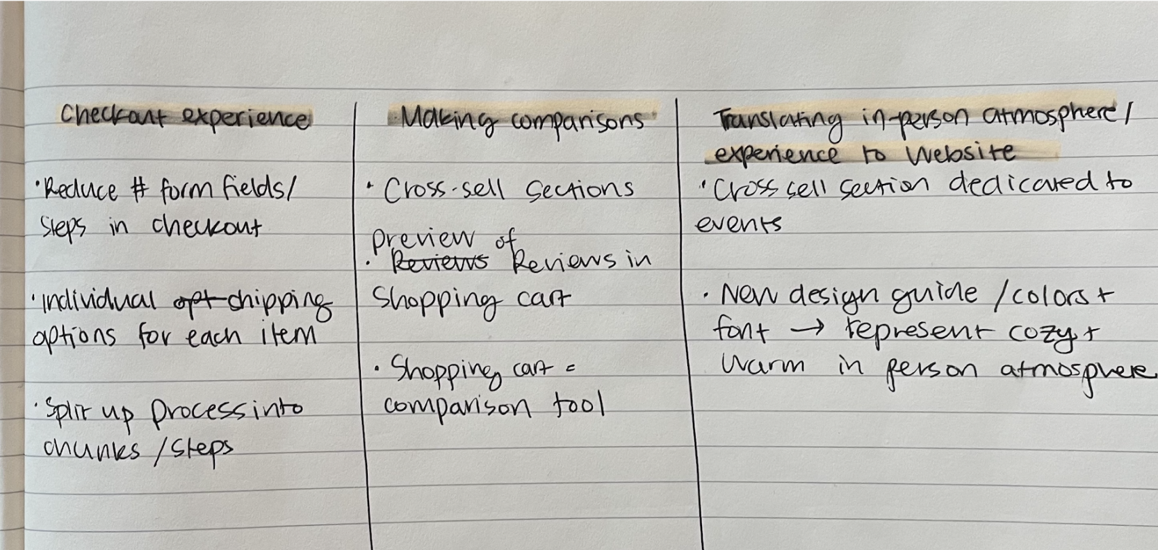
Brainstorming Ideas
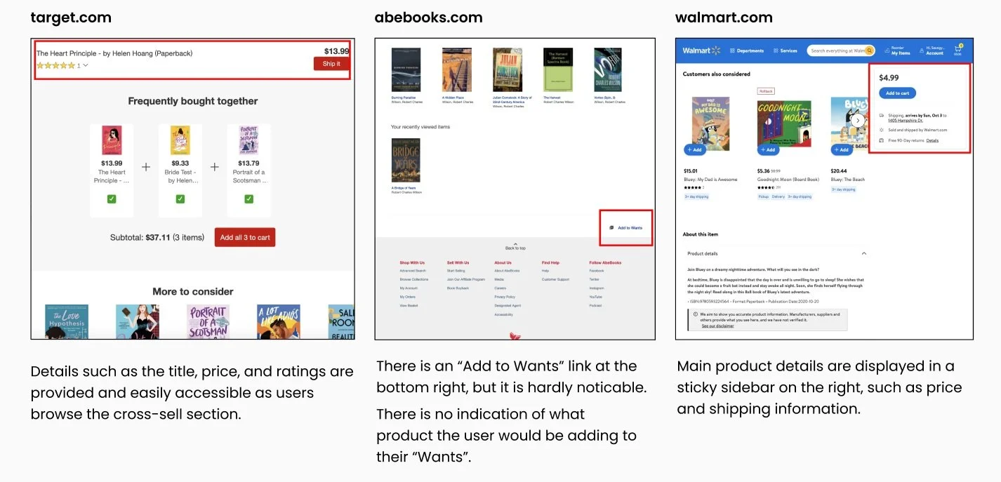
Competitive Analysis
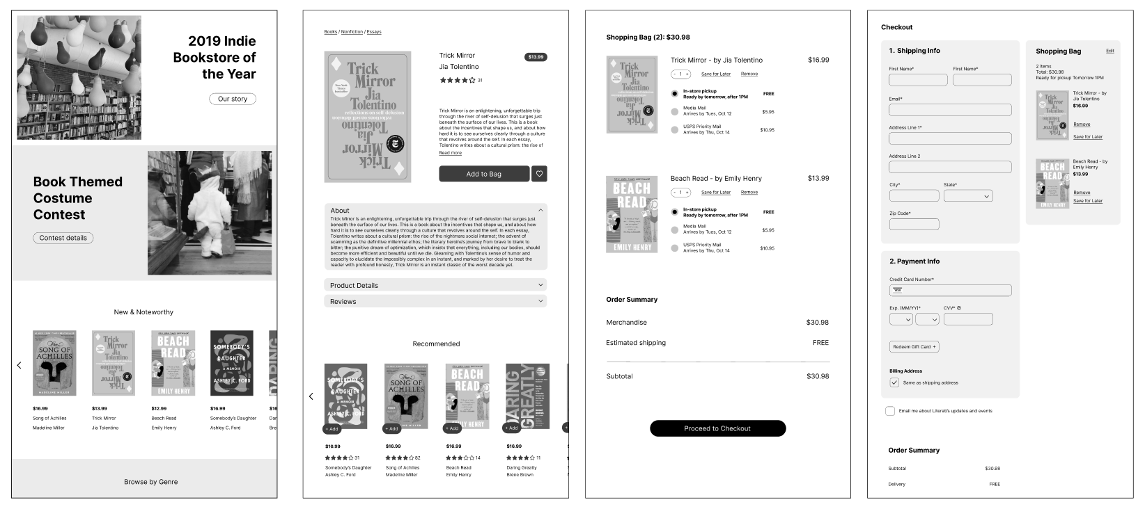
Wireframes
Key Design Decisions
01. Establish a clear visual hierarchy
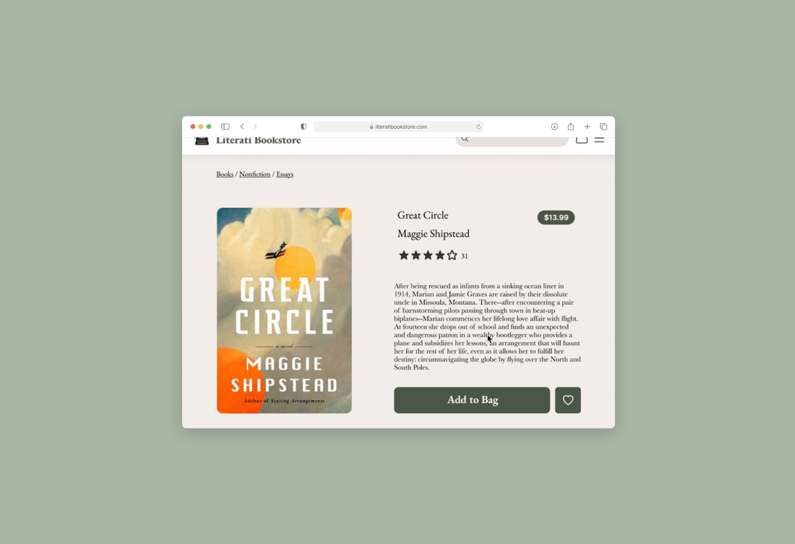
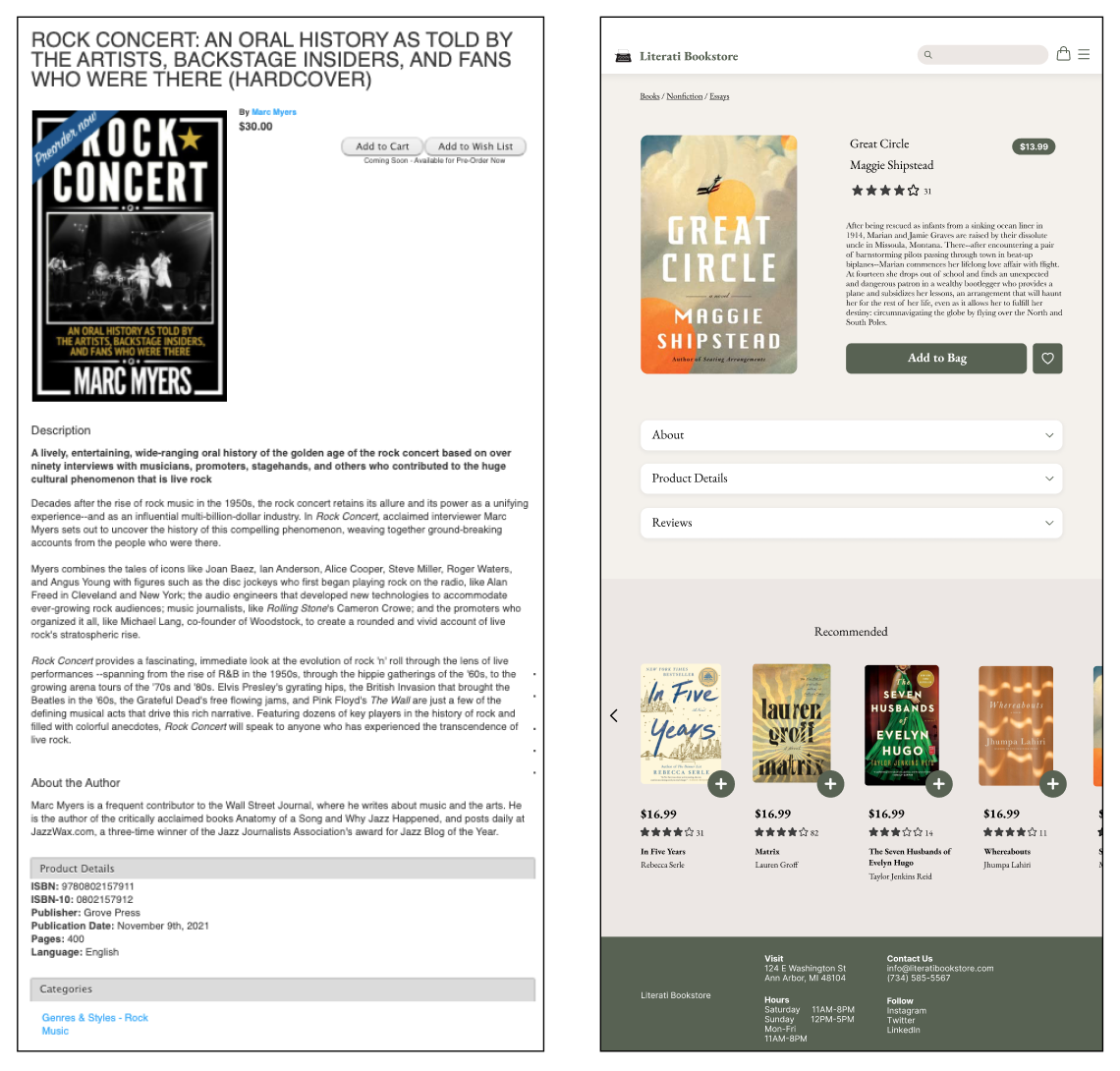
Before and after of Product Page
Before, the information was a wall of text with practically zero visual hierarchy amongst the different elements on the page. The lack of hierarchy increases cognitive load for users attempting to find key information.
With the redesign, I focused on making the information presented on this page easier to digest by establishing a clear visual hierarchy between elements and grouping information together in a logical way that would make more sense to users.
I also reduced the amount of information that is shown to users by default. Before, there was a full product description, ISBN numbers, and “An about the author” section. For the redesign, I displayed key information such as the book title, price, rating, and description preview, and had the rest of the information tucked away into expandable accordions.
The improved information hierarchy and organization of these details makes it easier for users to absorb this information which in turn helps them make a decision on whether this is a book they want to add to their bag or not.
Another decision I made was to increase the size of the add to bag button, which is the main call to action on this page. Before, it was difficult to find because it’s small and in the right corner of the page. So following the model of Fitt’s law, I made the add to bag button large and front-and-center on the page.
02. Created a style guide that reflects Literati’s identity
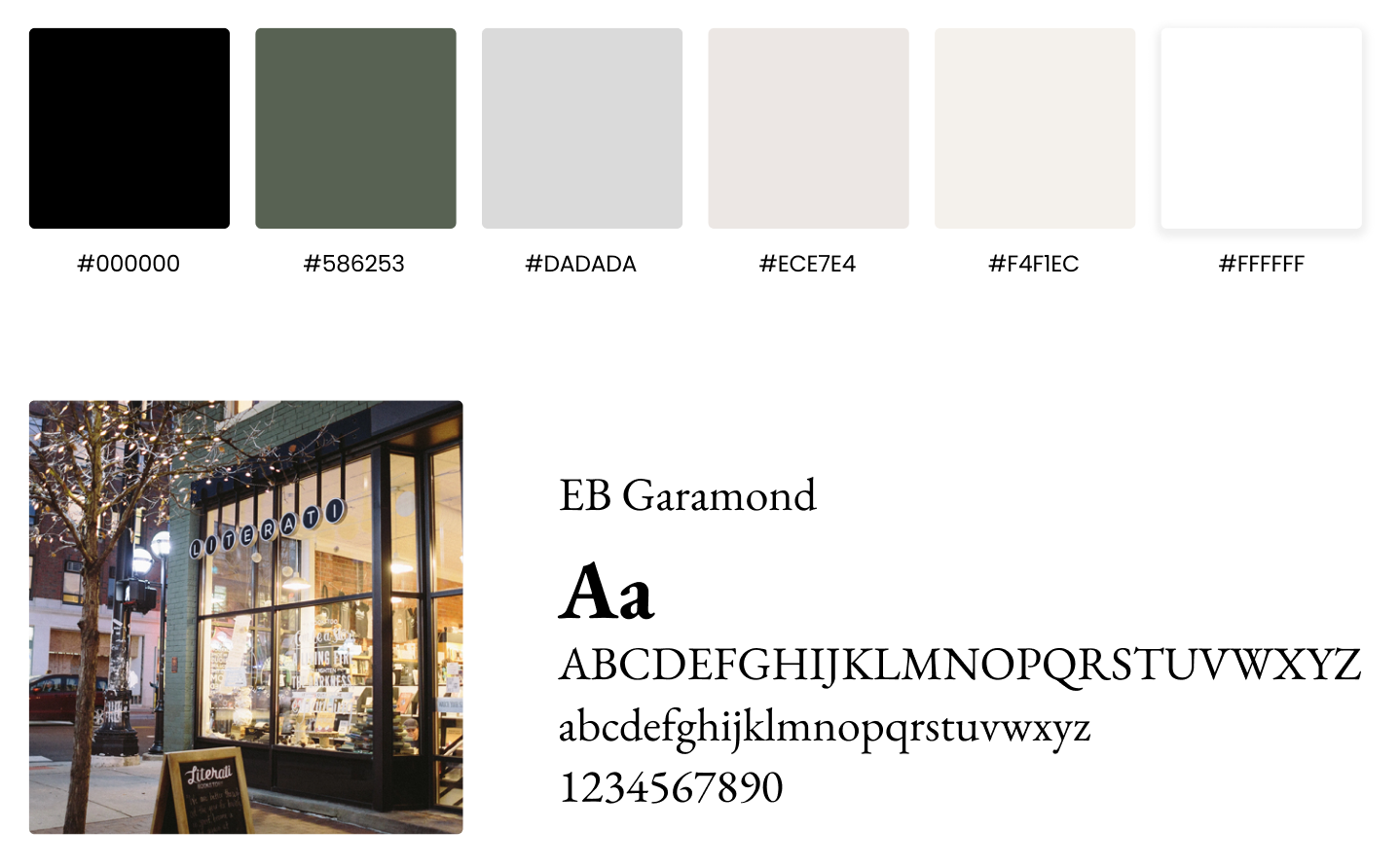
I crafted a style guide that is more reflective of Literati’s brand. I incorporated elements of Literati’s store. For example, Literati’s distinct green brick exterior inspired the accent color the the style guide. I chose warm beige tones that complemented this green and convey the warmth of the store. For the font, I chose a serif as it is more representative of Literati’s identity. They are big on handwritten notes and typewriters.
These are the visual design decisions I made in order to communicate the in person atmosphere through the site.
03. Support users in comparing products
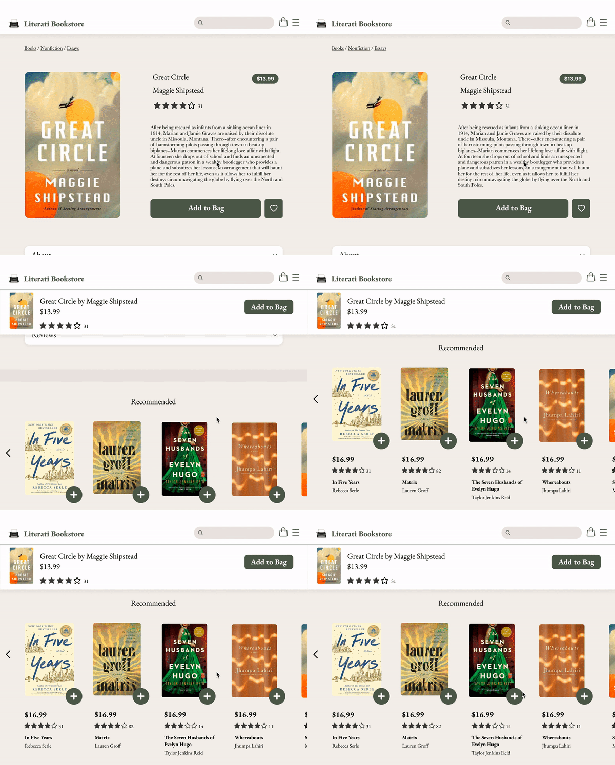
Product page scroll (sticky bar appears at top)
Since users have to scroll past the product information to the bottom of the page to view those recommended books, I made it so that the book’s basic information appears in a bar on the top of the screen when they scroll past the book’s details. The bar has details on the book such as the title, book thumbnail, rating and price, and this same information is available for all of the recommended books as well. This makes it easy for the user to compare the two books as the user doesn’t have to scroll back and forth from the top and bottom of the page. And then they can also add both books to their cart without having to navigate away from the page. These features make it easier for users to compare items and decide on whether they want to add them to their cart.
04. Streamline checkout flow
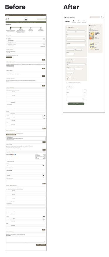
Length of checkout before and after redesign
I included prefilled information where appropriate in order to reduce the cognitive load for users during checkout as much as possible. For most users, their billing will be the same as their shipping address. Having this option pre-checked is what saved the most space on the checkout screen. I also had the State pre-filled as most of Literati’s customers are based in Michigan.
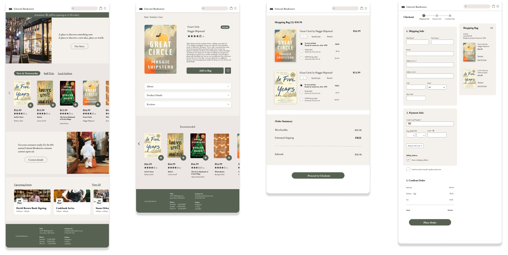
To further save space in checkout, I moved shipping options to the shopping bag. This gives users the opportunity to get an estimate of their total cost and arrival date before proceeding to checkout. This is important because the owner had mentioned that there was a lot of frustration and confusion around shipping. Making that information available to users upfront helps to reduce the frustration surrounding shipping options.
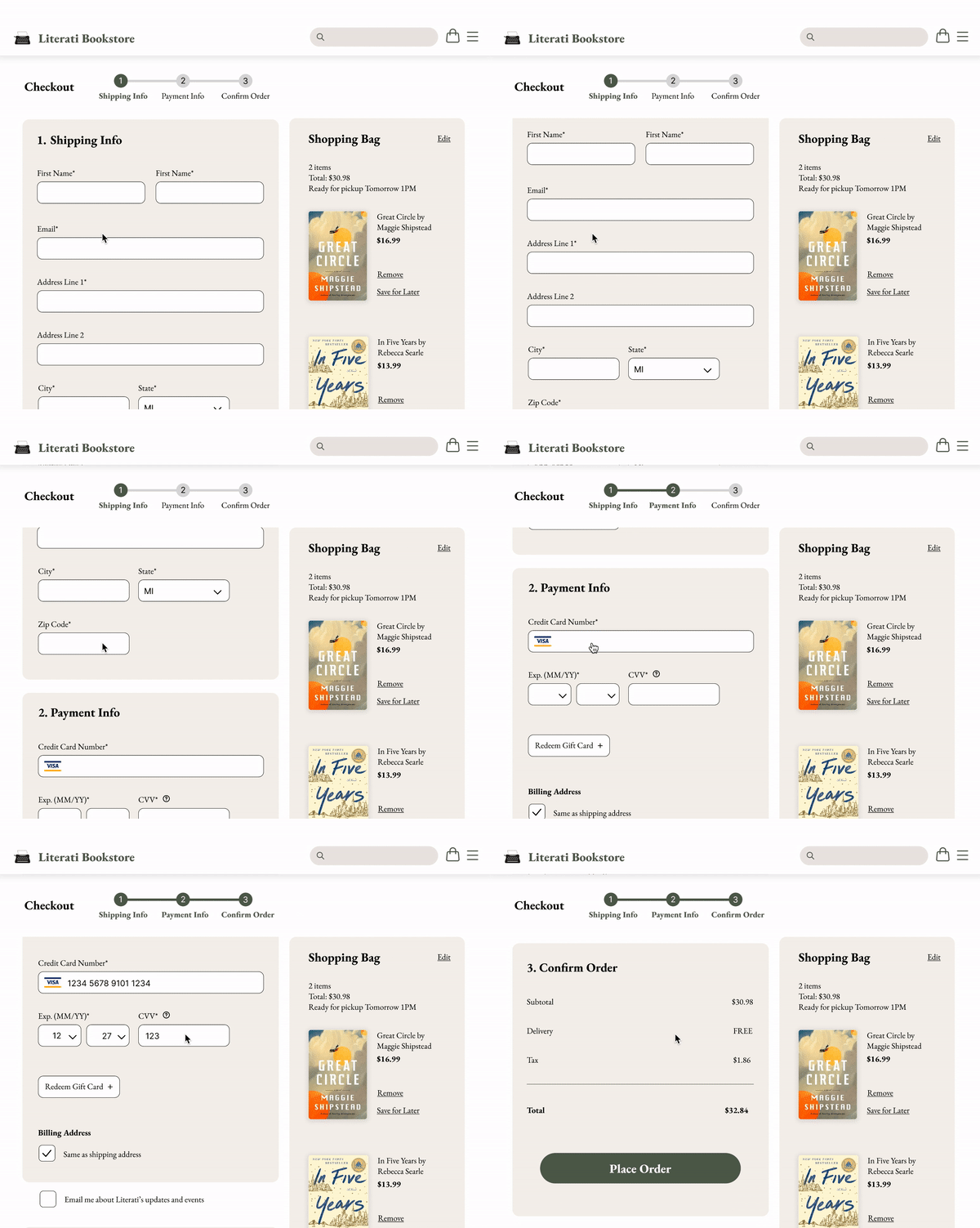
I also challenged myself to make this a one-page checkout because I really wanted to reduce the number of clicks. The benefit of a multi-page checkout, though, is that it splits it up into steps which makes the task feel more manageable for users.
My solution to this was to keep it a one-page checkout but chunk it into 3 steps, with a progress bar indicator at the top that gives users a visual cue of what step of the process they’re on, how much they have left, and gives them feedback that they’ve successfully completed a section. I also made the shopping bag stick to the right of the screen so that users can review or edit their bag at any point throughout the checkout process.
Overview of Final Screens
How would I measure success?
I’d look to the following KPIs to determine this:
Reduction in time spent at checkout
Increase in users adding items to bag
Increase in purchases
Increase in aesthetic appeal to users
Of these KPIs, I was able to (lightly) test the time spent in checkout and customers’ views on the aesthetics of the site.
Testing: Reduction in time spent in checkout
I gathered the same 5 participants from my user interviews and timed how long it took for them to complete the checkout process for each design.
the average time it took for them to get through the old checkout was over two minutes while with the new design they averaged over a minute for a 74% increase in speed. However, one confounding factor to note is the loading time in between sections on Literati’s site. I did pause the stopwatch during the loading times to account for this, but this could still be a confounding factor.
Testing: Increase in aesthetic appeal
To test whether there was an increase in aesthetic appeal, I conducted 5-second tests with 9 participants, where I showed the old and redesigned homepages to the participants for 5 seconds and asked a few questions afterward. I chose to test the homepage because first impressions matter.
The questions I asked the participants included:
Does this site appear trustworthy?
What are some words you’d use to describe this site?
What do you think this site sells?
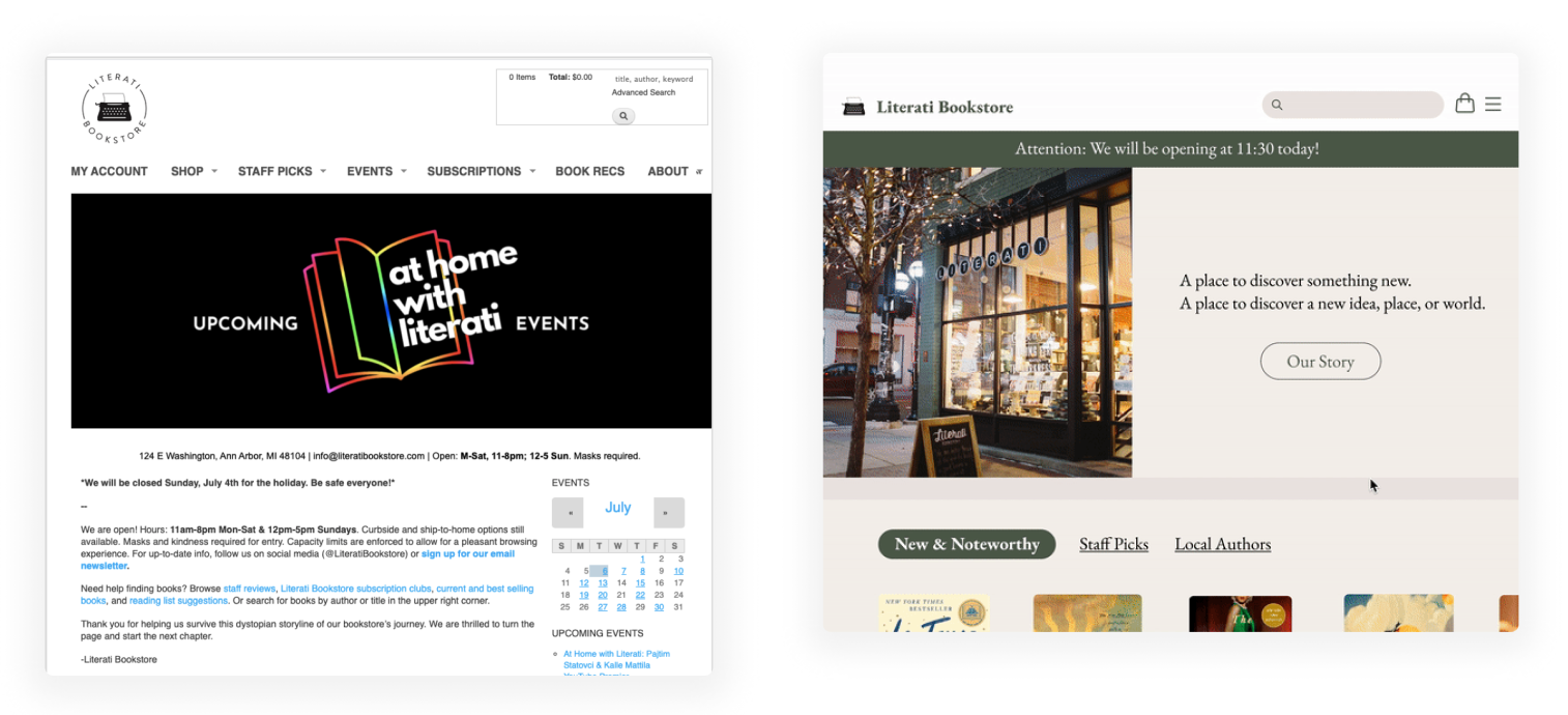
Before the redesign, a majority of participants did not view the site to be trustworthy and described the page as “plain but messy at the same time.” I had a couple participants say they were unsure what the company sells, and one thought that they sold events or subscriptions.
With the redesign, all participants viewed the site as trustworthy and described it as warm, cozy, and antique. They also all thought the site sells books. And since this is pretty subjective, I’ve taken it with a grain of salt but I think it offers at least some sort of indication that Literati’s brand identity is being conveyed through the redesign.
Before and after Homepage redesign
Key Takeaways
It’s important to have a clearly defined scope. I spent quite a bit of time drafting and editing my problem statement to make sure it was addressing both user and business needs, and that helped me narrow down my scope in terms of which aspects of the site would provide the most value if redesigned.
It’s good to check in with clients regularly to get feedback and discover any additional constraints.
This was a fun challenge! I enjoyed working on a problem within the e-commerce space but also tying in Literati’s unique needs as a small business.
Thanks for reading! You can check out my other work below :)
